When to Sell Crypto: What 9 Years of Exit Data Actually Show
Most crypto holders have a buying strategy. Almost none have a selling strategy. That asymmetry is where most of the losses live.
I've analyzed Bitcoin's price behavior across 3,210 daily candles spanning 2017 through 2026 — and what the data shows about when to exit positions challenges nearly every piece of conventional wisdom floating around crypto Twitter. "Sell in May and go away." "Hold through everything." "Time the halving." None of these hold up cleanly against the evidence. What does hold up is regime awareness — understanding whether capital is flowing into or out of the market before making exit decisions.
The Problem With Selling on Instinct
Most traders sell at one of three wrong moments: during a panic drop (locking in the loss), during a relief rally (selling too early), or never (watching gains evaporate back to breakeven). The root cause is that they're reacting to price, not to the underlying flow of capital.
Price is a symptom. Capital flow is the diagnosis.
Consider what "sell in May" actually looks like when you check the data instead of the folklore.
Summer Returns: The Data Destroys the Cliché
Here are Bitcoin's summer returns — measured from the May 1 open to the September 30 close — for every year I have complete data on:
| Year | May 1 Open | Sep 30 Close | Return |
|---|---|---|---|
| 2018 | $9,246 | $6,627 | -28.3% |
| 2019 | $5,322 | $8,289 | +55.8% |
| 2020 | $8,620 | $10,777 | +25.0% |
| 2021 | $57,697 | $43,824 | -24.0% |
| 2022 | $37,631 | $19,423 | -48.4% |
| 2023 | $29,233 | $26,963 | -7.8% |
| 2024 | $60,672 | $63,328 | +4.4% |
| 2025 | $94,172 | $114,049 | +21.1% |
Source: Anny analysis of historical BTC/USDT daily candle data, 2018–2025.
Four of these summers were negative. Four were positive. "Sell in May" would have saved you from -28.3%, -24.0%, -48.4%, and -7.8% drawdowns. It would have also made you exit before +55.8%, +25.0%, +4.4%, and +21.1% gains.
Selling based on the calendar isn't a strategy. It's a coin flip with a tax event attached.
The more useful question isn't when in the year to sell. It's in what market condition to sell. That requires a different framework entirely.
What the CFO Line Actually Measures
The CFO Line is a capital flow oscillator. It doesn't track price directly — it reads the balance between buying and selling pressure at the market structure level, then classifies the current environment into one of three regimes:
- Accumulate — Capital is flowing into the asset. Smart money is building positions.
- Wait — The market is in equilibrium or transition. No strong directional pressure.
- Distribute — Capital is flowing out. Selling pressure is dominant.
These aren't guesses or vibes. They're classifications derived from how money is actually moving through the market, not how the price is responding to that movement. If you want to understand the broader mechanics of what accumulation and distribution look like in practice, this breakdown covers it in depth.
The regimes are the input. Price eventually follows.
The Evidence: Regime vs. Return
Now look at what happened inside each of those summers when I break down the regime composition — how many of the 153 days between May 1 and September 30 were classified as Accumulate, Wait, or Distribute.
| Year | Return | Accumulate | Wait | Distribute |
|---|---|---|---|---|
| 2018 | -28.3% | 0% (0d) | 44% (67d) | 56% (86d) |
| 2019 | +55.8% | 58% (88d) | 39% (59d) | 4% (6d) |
| 2020 | +25.0% | 59% (91d) | 41% (62d) | 0% (0d) |
| 2021 | -24.0% | 28% (43d) | 30% (46d) | 42% (64d) |
| 2022 | -48.4% | 0% (0d) | 23% (35d) | 77% (118d) |
| 2023 | -7.8% | 24% (36d) | 52% (80d) | 24% (37d) |
| 2024 | +4.4% | 17% (26d) | 51% (78d) | 32% (49d) |
| 2025 | +21.1% | 62% (95d) | 38% (58d) | 0% (0d) |
Source: Anny CFO Line regime classification applied to historical BTC/USDT daily candle data, 2018–2025.
The pattern is not subtle.
The three worst summers — -48.4% in 2022, -28.3% in 2018, -24.0% in 2021 — were all Distribute-dominant. The 2022 summer spent 77% of its days (118 out of 153) in Distribute. The 2018 summer spent 56% of its days (86 out of 153) in Distribute. The 2021 summer spent 42% of its days (64 out of 153) in Distribute.
The three strongest summers — +55.8% in 2019, +25.0% in 2020, +21.1% in 2025 — were all Accumulate-dominant. In 2019, 58% of summer days (88 out of 153) were in Accumulate. In 2020, that was 59% (91 out of 153). In 2025, 62% (95 out of 153).
In those three bull summers, Distribute was nearly absent — 4 days (4%) in 2019, zero days in 2020, zero days in 2025.
The mixed results — 2023 at -7.8% and 2024 at +4.4% — were Wait-dominant summers, where neither buyers nor sellers held structural control. The market drifted rather than trending.
This is the core insight: exits made during Distribute regimes are exits made with the flow, not against it. Exits made during Accumulate regimes are exits made against the tide.
Q1 Returns Add Another Layer
The pattern extends beyond summer. Q1 data — January 1 open to March 31 close — across nine years shows similar regime sensitivity:
| Year | Return |
|---|---|
| 2018 | -49.5% |
| 2019 | +10.9% |
| 2020 | -10.9% |
| 2021 | +103.1% |
| 2022 | -1.5% |
| 2023 | +72.1% |
| 2024 | +68.6% |
| 2025 | -11.8% |
| 2026 | -22.1% |
Source: Anny analysis of historical BTC/USDT daily candle data, 2018–2026.
The variance across Q1 is enormous — from -49.5% in 2018 to +103.1% in 2021. Anyone who built a rule like "Q1 is bullish" or "Q1 is a trap" would have been right roughly half the time and wrong the other half.
Calendar rules can't capture this range. Regime awareness can, because the regime shifts before the full return materializes. For more on how those regime signals behave during uncertain transitions, the CFO Line wait-flip analysis covers a specific case study in detail.
What This Data Doesn't Prove
Before I state any principles, the limitations matter.
N=8 summers is a signal worth examining — not a statistically proven law. The pattern is consistent and directionally coherent, but eight data points cannot carry the weight of a trading rule on their own.
This is Bitcoin. Bitcoin is the survivor of the crypto asset class. Analyzing its behavior tells you nothing about assets that ceased to exist — and there are many. Survivorship bias means the patterns here are structurally rosier than what a diversified crypto portfolio would have experienced. To track what Bitcoin is actually trading at in real-time, the BTC/USDT converter is a quick reference, and similar live snapshots exist for ETH/USDT and SOL/USDT.
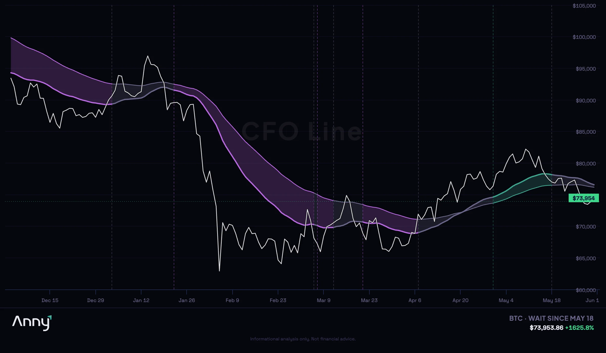
Regimes shift. The CFO Line doesn't predict — it classifies. A Distribute regime tells you where capital is currently flowing. It doesn't guarantee continued distribution. The recent 2026 flips illustrate this clearly: the market moved from Distribute → Wait on March 12, back to Distribute on March 21, back to Wait on April 7, then to Accumulate on April 30, and back to Wait on May 18. That's five regime changes in under three months.
Frameworks shift probabilities. They don't eliminate uncertainty.
The Actual Answer: Regime-Level Exit Principles
Given the data, here's what I'd distill into actionable principles — not price targets, not calendar rules:
1. Distribute regimes are exit windows, not signals to panic-sell everything.
When capital flow turns distributive, it's the structurally appropriate time to evaluate reducing exposure. Not because price will definitely fall — but because you're now exiting with the dominant flow rather than against it.
2. Accumulate regimes are not selling conditions.
The worst exits in this dataset — the ones where sellers surrendered to Distribute-dominant markets — could have been avoided. Selling into an Accumulate regime means fighting the direction money is actually moving.
3. Wait regimes require patience, not action.
The 2023 and 2024 summers — both Wait-dominant, both near-flat in return — show what happens when the market has no structural conviction. Forcing exits or entries in Wait conditions produces transaction costs and emotional volatility without meaningful return advantage.
4. The regime matters more than the month.
"Sell in May" is right roughly as often as it's wrong. The regime classification in May is what actually carries information about what the next five months will look like.
5. Watch for Distribute → Accumulate transitions carefully.
These are the pivots where the biggest mispriced exits happen — selling during a transition before confirming the new regime has taken hold. Trend-following with regime context covers why timing relative to trend confirmation matters more than timing relative to price level.
The Question That Matters
Most crypto holders ask: "What price should I sell at?"
That's the wrong question. Price is the scoreboard. Regime is the game.
The right question is: "What is the current flow of capital doing — and am I exiting with it or against it?"
Nine years of Bitcoin data suggest this distinction has been the difference between exiting into a -48.4% drawdown and holding through a +55.8% gain. The calendar won't tell you that. A price alert won't tell you that. The regime will.
Run a free portfolio scan. Check the CFO Line to see what regime your assets are in right now →
For a complete plan that connects entries, holding decisions, and exits, see the 2027 crypto investment strategy framework.
This analysis is for educational purposes only — not financial advice. Past performance does not indicate future results. Statistics cited are from analysis of historical data and may not reflect future market conditions. Anny is an AI-powered analytics platform, not a registered investment adviser. Crypto assets are volatile and you can lose your entire investment.
Want Anny's AI to analyze your portfolio? Try the Anny Line or see pricing.